Gubatenkov.dev

How to make 3D AI Cup Configurator on Three.js and React.js [Part 2]

Avatar of Slava Gubatenko, author of the post
Slava Gubatenko Animated direct message icon

12 min read

Then, according to the 2nd point from the plan above, we will implement the remaining functionality. Go to components/Configurator/Canvas2D/Actions.tsx and write logic in the click handler for each of the Actions:

.../Canvas2D/Actions.tsx
tsx
const actions: CanvasAction[] = useMemo(
() =>
[
{
component: {
props: {
onClick: () => {
if (!canvas) return
// Remove all objects from fabric canvas
canvas
.remove(...canvas.getObjects())
// Clear canvas background
.setBackgroundImage(
null as unknown as Image,
canvas.renderAll.bind(canvas)
)
// Patterns are set as the background color, so don't forget to clear them too
.setBackgroundColor('#f2f2f2', () => {})
.renderAll()
},
},
element: Button,
},
icon: {
props: {
className: '',
size: 16,
},
element: XIcon,
},
name: 'Clear canvas',
},
{
component: {
props: {
onClick: () => {
if (!canvas) return
// Clear canvas background
canvas
.setBackgroundImage(
null as unknown as Image,
canvas.renderAll.bind(canvas)
)
.setBackgroundColor(
// The patterns are the background, so clean it up as well.
'#f2f2f2',
() => {}
)
.renderAll()
},
},
element: Button,
},
icon: {
props: {
className: '',
size: 16,
},
element: XSquareIcon,
},
name: 'Remove background',
},
{
component: {
props: {
onClick: () => {
if (!canvas) return
const activeObject = canvas.getActiveObject()
if (!activeObject) return
canvas.sendToBack(activeObject).discardActiveObject()
},
},
element: Button,
},
icon: {
props: {
className: '',
size: 16,
},
element: ArrowDownFromLineIcon,
},
name: 'Send selection to back',
},
{
component: {
props: {
onClick: () => {
if (!canvas) return
const activeObject = canvas.getActiveObject()
if (!activeObject) return
canvas.bringToFront(activeObject).discardActiveObject()
},
},
element: Button,
},
icon: {
props: {
className: 'rotate-180',
size: 16,
},
element: ArrowDownFromLineIcon,
},
name: 'Bring selection to front',
},
{
component: {
props: {
onClick: () => {
if (!canvas) return
downloadCanvasAsImage(canvas.lowerCanvasEl)
},
},
element: Button,
},
icon: {
props: {
className: '',
size: 16,
},
element: FileDownIcon,
},
name: 'Save canvas as image',
},
] satisfies CanvasAction[],
[canvas]
)

Don’t forget to check the import for downloadCanvasAsImage() from lib/utils.ts for the “Save canvas as image” action:

lib/utils.ts
ts
export function downloadCanvasAsImage(canvas: HTMLCanvasElement) {
let downloadLink = document.createElement('a')
downloadLink.setAttribute('download', 'cup-configuration.png')
canvas.toBlob(function (blob) {
if (!blob) return
let url = URL.createObjectURL(blob)
downloadLink.setAttribute('href', url)
downloadLink.click()
})
}

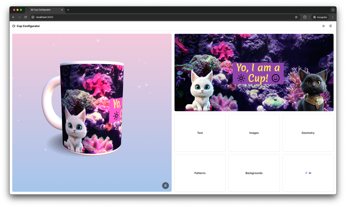
After that try to clear the standard Canvas2D image by clicking on “Clear canvas” action and if you succeeded and the image is gone, then go to the 3rd point of the plan.

According to the 3rd point of the algorithm for creating 3D cup configurator, go to the component in the components/Cup.tsx directory and add the necessary logic for animating the appearance of the mug, display the mug itself and the texture of the print on the mug based on the information from Canvas2D. Then the component will look as follows:

tsx
// ...imports and types
export default function Cup() {
const { materials, nodes } = useGLTF(cupModelPath, true) as GLTFResult
const props = useTexture({
displacementMap: `${baseTexturesPath}/displacement.jpg`,
roughnessMap: `${baseTexturesPath}/roughness.jpg`,
normalMap: `${baseTexturesPath}/normalDX.jpg`,
map: `${baseTexturesPath}/color.jpg`,
})
const canvas = useStore(({ fabricCanvas }) => fabricCanvas)
const texture = canvas && new CanvasTexture(canvas.lowerCanvasEl)
const cupDrawAreaRef = useRef<CupDrawAreaMesh>(null)
const groupRef = useRef<Group>(null)
useFrame(() => {
// Prepare texture settings
if (texture) {
texture.flipY = false
texture.anisotropy = 2
}
// Assign texture to the target material
if (cupDrawAreaRef.current) {
cupDrawAreaRef.current.material.map = texture
;(cupDrawAreaRef.current.material.map as Texture).needsUpdate = true
}
// Scale cup animation
if (groupRef.current && groupRef.current.scale.x < 1) {
groupRef.current.scale.x += 0.01
groupRef.current.scale.y += 0.01
groupRef.current.scale.z += 0.01
}
})
return (
<group {...props} dispose={null} ref={groupRef} scale={0}>
// ...
</group>
)

Also in components/Configurator/Canvas3D.tsx I propose to remove the comment for the Sparkles component from 43 to 49 lines and thus add a little charm to the scene with the mug and then our application at this stage will look like this:

Print from Canvas2D rendered on the cup model

Let’s continue the implementation of 3D cup configurator and follow the 4th point of the development plan described in the first part. And let’s start with the Text panel.

Text panel implementation

First of all, let’s implement the function of adding and deleting text on Canvas2D. In the CreateDeleteTextButtons.tsx component add logic so that the component looks as follows:

tsx
'use client'
import { Separator } from '@/components/ui/separator'
import { Button } from '@/components/ui/button'
import { useFabricCanvas } from '@/lib/hooks'
import { useStore } from '@/lib/store'
import { fabric } from 'fabric'
export default function CreateDeleteTextButtons() {
const { textSettings } = useStore(({ panels }) => ({
textSettings: panels.text.data.textSettings,
}))
const { canvas } = useFabricCanvas()
const handleCreateText = () => {
if (!canvas || textSettings.text === undefined) return
const textbox = new fabric.Textbox(textSettings.text, textSettings)
// Apply some adjustments
canvas.centerObject(textbox).setActiveObject(textbox).add(textbox)
// Set focus on created textbox
textbox.setSelectionEnd(textSettings.text.length)
textbox.enterEditing()
}
const handleRemoveText = () => {
if (!canvas) return
const selectedObject = canvas.getActiveObject()
if (selectedObject instanceof fabric.Textbox) {
canvas.remove(selectedObject)
}
}
return (
<>
<Button
className="h-auto w-full px-4 py-2 text-xs 2xl:text-sm"
onClick={handleCreateText}
>
Add Text
</Button>
<Separator className="mx-1 h-4 2xl:mx-2 2xl:h-6" orientation="vertical" />
<Button
className="h-auto w-full px-4 py-2 text-xs 2xl:text-sm"
onClick={handleRemoveText}
>
Delete Selected
</Button>
</>
)
}

Let’s add the ability to change text alignment and style settings by adding logic to the ToggleAlignAndStyleTextGroups/index.tsx component:

tsx
'use client'
import type { AlignValue } from '@/lib/types'
import { Separator } from '@/components/ui/separator'
import { useStore } from '@/lib/store'
import ToggleAlignGroup from './ToggleAlignGroup'
import ToggleStyleGroup from './ToggleStyleGroup'
export default function ToggleAlignAndStyleTextGroups() {
const { setTextSettings, textSettings } = useStore(
({ setTextSettings, panels }) => ({
textSettings: panels.text.data.textSettings,
setTextSettings,
})
)
const handleAlignValueChange = (value: AlignValue) => {
if (!value) return
setTextSettings({
textAlign: value,
})
}
const handleStyleValueChange = (styles: string[]) => {
setTextSettings({
fontStyle: styles.includes('italic') ? 'italic' : 'normal',
fontWeight: styles.includes('bold') ? 'bold' : 'normal',
underline: styles.includes('underline'),
})
}
const getFontStyleValue = (): string[] => {
const styles = []
if (textSettings.fontWeight === 'bold') {
styles.push('bold')
}
if (textSettings.fontStyle === 'italic') {
styles.push('italic')
}
if (textSettings.underline) {
styles.push('underline')
}
return styles
}
return (
<>
<ToggleAlignGroup
value={(textSettings.textAlign ?? 'left') as AlignValue}
onValueChange={handleAlignValueChange}
/>
<Separator className="mx-4 h-4 2xl:mx-6 2xl:h-6" orientation="vertical" />
<ToggleStyleGroup
onValueChange={handleStyleValueChange}
value={getFontStyleValue()}
/>
</>
)
}

Let’s add logic to FontSizeSlider.tsx:

tsx
'use client'
import { Slider } from '@/components/ui/slider'
import { useStore } from '@/lib/store'
export default function FontSizeSlider() {
const { setTextSettings, textSettings } = useStore(
({ setTextSettings, panels }) => ({
textSettings: panels.text.data.textSettings,
setTextSettings,
})
)
const handleFontSizeChange = (fontSizeValue: [number]) => {
setTextSettings({
fontSize: fontSizeValue[0],
})
}
return (
<Slider
value={[textSettings.fontSize ?? 14]}
onValueChange={handleFontSizeChange}
max={100}
step={1}
min={1}
/>
)
}

Also to LineHeightSlider.tsx:

tsx
'use client'
import { Slider } from '@/components/ui/slider'
import { useStore } from '@/lib/store'
export default function LineHeightSlider() {
const { setTextSettings, textSettings } = useStore(
({ setTextSettings, panels }) => ({
textSettings: panels.text.data.textSettings,
setTextSettings,
})
)
const handleLineHeightChange = (lineHeightValue: [number]) => {
setTextSettings({
lineHeight: lineHeightValue[0],
})
}
return (
<Slider
onValueChange={handleLineHeightChange}
value={[textSettings.lineHeight ?? 1]}
step={0.1}
min={0.1}
max={2}
/>
)
}

Also to FontFamilySelect.tsx:

tsx
'use client'
import {
SelectContent,
SelectTrigger,
SelectGroup,
SelectValue,
SelectItem,
Select,
} from '@/components/ui/select'
import { useStore } from '@/lib/store'
export default function FontFamilySelect() {
const { setTextSettings, textSettings } = useStore(
({ setTextSettings, panels }) => ({
textSettings: panels.text.data.textSettings,
setTextSettings,
})
)
return (
<Select
onValueChange={(fontFamily) => {
setTextSettings({ fontFamily })
}}
value={textSettings.fontFamily}
>
<SelectTrigger className="h-8 w-full 2xl:h-10">
<SelectValue />
</SelectTrigger>
<SelectContent>
<SelectGroup>
<SelectItem className="font-lato" value="Lato">
Lato
</SelectItem>
<SelectItem className="font-caveat" value="Caveat">
Caveat
</SelectItem>
<SelectItem className="font-merienda" value="Merienda">
Merienda
</SelectItem>
<SelectItem className="font-lemonada" value="Lemonada">
Lemonada
</SelectItem>
<SelectItem className="font-dancing-script" value="Dancing Script">
Dancing Script
</SelectItem>
</SelectGroup>
</SelectContent>
</Select>
)
}

Next, the BackgroundColorListItems.tsx component:

tsx
'use client'
import { CheckIcon } from 'lucide-react'
import { useStore } from '@/lib/store'
import { cn } from '@/lib/utils'
const fillColors = [
'#ff000000',
'#1fbc9c',
'#1ca085',
'#2ecc70',
'#27af60',
'#3398db',
'#2980b9',
'#a463bf',
'#8e43ad',
'#3d556e',
'#222f3d',
'#f2c511',
'#f39c19',
'#e84b3c',
] as const
export default function BackgroundColorListItems() {
const { setTextSettings, textSettings } = useStore(
({ setTextSettings, panels }) => ({
textSettings: panels.text.data.textSettings,
setTextSettings,
})
)
const updateBackgroundColor = (color: string) => {
setTextSettings({
backgroundColor: color,
})
}
return fillColors.map((color, index) => (
<li
className="relative h-7 w-7 shrink-0 cursor-pointer rounded-full border border-zinc-300 2xl:h-10 2xl:w-10"
style={{
backgroundColor: color,
}}
onClick={() => updateBackgroundColor(color)}
key={index}
>
<div
className={cn(
color === textSettings.backgroundColor ? 'flex' : 'hidden',
'h-full w-full items-center justify-center rounded-full bg-black/30',
'absolute left-1/2 top-1/2 -translate-x-1/2 -translate-y-1/2'
)}
>
<CheckIcon className="text-gray-200" size={16} />
</div>
</li>
))
}

And the FontColorListItems.tsx component:

tsx
'use client'
import { CheckIcon } from 'lucide-react'
import { useStore } from '@/lib/store'
import { cn } from '@/lib/utils'
const fontColors = [
'#ffffff',
'#ed120f',
'#e98860',
'#ffee58',
'#00e676',
'#1e88e5',
'#8e43ad',
'#111111',
] as const
export default function FontColorListItems() {
const { setTextSettings, textSettings } = useStore(
({ setTextSettings, panels }) => ({
textSettings: panels.text.data.textSettings,
setTextSettings,
})
)
const updateFontColor = (color: string) => {
setTextSettings({ fill: color })
}
return fontColors.map((color, index) => (
<li
className="relative h-7 w-7 shrink-0 cursor-pointer rounded-full border border-zinc-300 2xl:h-10 2xl:w-10"
style={{
backgroundColor: color,
}}
onClick={() => updateFontColor(color)}
key={index}
>
<div
className={cn(
color === textSettings.fill ? 'flex' : 'hidden',
'h-full w-full items-center justify-center rounded-full bg-black/30',
'absolute left-1/2 top-1/2 -translate-x-1/2 -translate-y-1/2'
)}
>
<CheckIcon className="text-gray-200" size={16} />
</div>
</li>
))
}

Also HexColorInput.tsx:

tsx
'use client'
import { Button } from '@/components/ui/button'
import { Input } from '@/components/ui/input'
import { ElementRef, useRef } from 'react'
import { useStore } from '@/lib/store'
type Props = { name: 'backgroundColor' | 'fill' }
export default function HexColorInput({ name }: Props) {
const { setTextSettings, textSettings } = useStore(
({ setTextSettings, panels }) => ({
textSettings: panels.text.data.textSettings,
setTextSettings,
})
)
const inputRef = useRef<ElementRef<'input'>>(null)
const handleClick = () => {
let inputValue = inputRef.current?.value
inputValue ??= ''
const inputName = name
const validHexColorRegexp = /^#[0-9A-F]{6}[0-9a-f]{0,2}$/i
// Check if user entered a valid hex string
if (validHexColorRegexp.test(inputValue)) {
setTextSettings({
[inputName]: inputValue,
})
}
}
return (
<>
<Input
className="h-8 placeholder:text-xs 2xl:h-9 2xl:placeholder:text-sm"
placeholder="HEX string e.g. #ffffff"
ref={inputRef}
type="string"
name={name}
/>
<Button
className="h-auto px-4 py-2 text-xs 2xl:text-sm"
onClick={handleClick}
>
Apply
</Button>
</>
)
}

As well as TextSettingsPanel/index.tsx:

tsx
'use client'
import { useFabricCanvas } from '@/lib/hooks'
import { ReactNode, useEffect } from 'react'
import { useStore } from '@/lib/store'
import { fabric } from 'fabric'
type Props = {
children: ReactNode
}
export default function TextSettingsPanel({ children }: Props) {
const { canvas } = useFabricCanvas()
const { setTextSettings, textSettings } = useStore(
({ setTextSettings, panels }) => ({
textSettings: panels.text.data.textSettings,
setTextSettings,
})
)
// Rerender textSettings on change
useEffect(() => {
if (!canvas) return
const handleUpdateActiveTextbox = () => {
// Get selected canvas object
const activeObj = canvas.getActiveObject()
// Check if this is fabric Text
if (activeObj instanceof fabric.IText) {
// Apply updates to text
activeObj.set({
...textSettings,
text: activeObj.text,
})
// Render updates on fabric canvas
canvas.renderAll()
}
}
handleUpdateActiveTextbox()
}, [canvas, textSettings])
// Handle canvas events
useEffect(() => {
const handleCurrentSelection = (e: fabric.IEvent<MouseEvent>) => {
// When no active objects on canvas
if (!e.selected?.length) return
const selection = e.selected[0]
// Continue if selection is fabric.Textbox
if (selection instanceof fabric.Textbox) {
/* We don't need all the text props, so choose only
* those that what we need. */
const {
backgroundColor,
fontWeight,
fontFamily,
lineHeight,
textAlign,
underline,
fontStyle,
fontSize,
height,
width,
text,
fill,
} = selection
setTextSettings({
backgroundColor,
fontWeight,
fontFamily,
lineHeight,
textAlign,
underline,
fontStyle,
fontSize,
height,
width,
text,
fill,
})
}
}
canvas
?.on('selection:created', handleCurrentSelection)
?.on('selection:updated', handleCurrentSelection)
}, [canvas, setTextSettings])
return (
<div className="grid h-full w-full grid-cols-2 gap-4 2xl:gap-8">
{children}
</div>
)
}

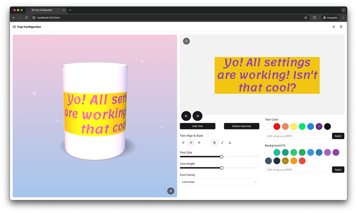
And after that, try changing all the text settings to check that all components have the expected behavior. In my case, I created the following text:

Working text panel with modified settings

Images panel implementation

Let’s continue with the implementation and move on to writing the logic for the Images panel. Let’s start with the UploadImageButton.tsx component:

tsx
'use client'
import type { ElementRef } from 'react'
import { useFabricCanvas } from '@/lib/hooks'
import { PaperclipIcon } from 'lucide-react'
import { Card } from '@/components/ui/card'
import { useEffect, useRef } from 'react'
import { fabric } from 'fabric'
export default function UploadImageButton() {
const inputRef = useRef<ElementRef<'input'>>(null)
const { canvas } = useFabricCanvas()
/* Listen to the input for the image load event,
* then display it on the canvas */
useEffect(() => {
const inputElement = inputRef.current
if (!inputElement) return
const handleUploadedImage = (e: Event) => {
const eventTarget = e.target as HTMLInputElement
const fileList = eventTarget.files
if (!fileList || fileList.length === 0) return
const reader = new FileReader()
const loadedImageFile = fileList[0]
reader.onload = (e) => {
const data = e.target!.result
fabric.Image.fromURL(data as string, (img) => {
if (!canvas) return
const scaleTo = canvas.width && img.width && canvas.width / img.width
const imageObject = img.scale(scaleTo || 0.5)
canvas.centerObject(imageObject).add(imageObject).renderAll()
})
}
reader.readAsDataURL(loadedImageFile)
}
inputElement.addEventListener('change', handleUploadedImage)
return () => inputElement.removeEventListener('change', handleUploadedImage)
}, [canvas])
return (
<Card className="relative flex h-full w-full items-center justify-center">
<input
className="absolute h-full w-full cursor-pointer opacity-0"
ref={inputRef}
type="file"
/>
<PaperclipIcon className="h-6 w-6 2xl:h-8 2xl:w-8" />
</Card>
)
}

And the SetImageButton.tsx component:

tsx
'use client'
import ImageButton from '@/components/ImageButton'
import { useFabricCanvas } from '@/lib/hooks'
import { fabric } from 'fabric'
export default function SetImageButton({
imageUrl,
index,
}: {
imageUrl: string
index: number
}) {
const { canvas } = useFabricCanvas()
const handleClick = () => {
if (!canvas) return
fabric.Image.fromURL(imageUrl, (image) => {
image.scale(0.5)
canvas.centerObject(image)
canvas.add(image)
})
}
return <ImageButton onClick={handleClick} imageUrl={imageUrl} index={index} />
}

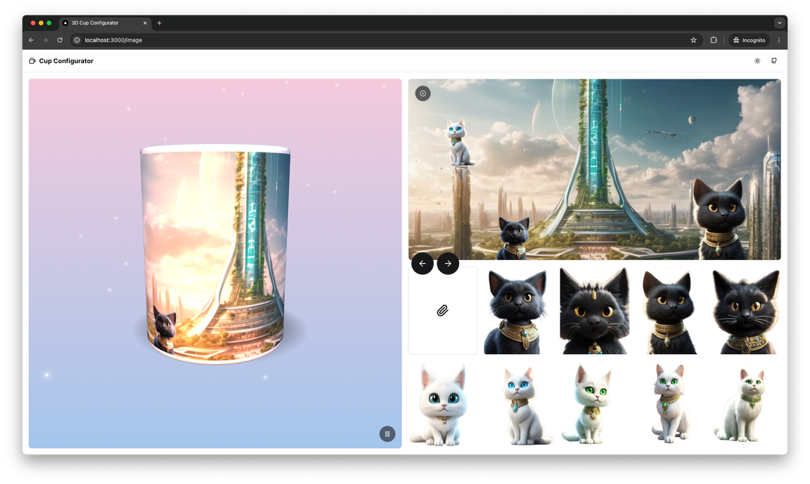
Now let’s try loading the pre-made images onto Canvas2D and then our own and adjust the layers using the appropriate actions. This is what I got:

Pre-made images and uploaded background image on Canvas2D

Wow! That looks amazing! It’s time for a brief summary of what’s been done.

Summury

In this part we continued building the configurator functionality and implemented components for the large Text panel and for the Image panel. In the final article we will create the remaining components and finish creating the application by deploying the source code on Github and Vercel.