Gubatenkov.dev

How to make 3D AI Cup Configurator on Three.js and React.js [Part 3]

Avatar of Slava Gubatenko, author of the post
Slava Gubatenko Animated direct message icon

9 min read

Geometry panel implementation

Now let’s move on to the implementation of the Geometry panel. Here everything is simple. In the GeometryList.tsx component add a click handler for each GeometryItem to make it look like this:

tsx
'use client'
import {
TriangleIcon,
CircleIcon,
SquareIcon,
MinusIcon,
HeartIcon,
SmileIcon,
BabyIcon,
SunIcon,
} from 'lucide-react'
import { useFabricCanvas } from '@/lib/hooks'
import { Card } from '@/components/ui/card'
import { useMemo } from 'react'
import { fabric } from 'fabric'
export default function GeometryList() {
const { canvas } = useFabricCanvas()
const geometryItems = useMemo(
() => [
{
handleAddItem: () => {
if (!canvas) return
const line = new fabric.Line([125, 250, 175, 250], {
stroke: 'black',
strokeWidth: 2,
fill: 'black',
})
canvas.centerObject(line)
canvas.add(line)
},
icon: MinusIcon,
},
{
handleAddItem: () => {
if (!canvas) return
const ellipse = new fabric.Ellipse({
fill: 'transparent',
stroke: 'black',
strokeWidth: 2,
rx: 50,
ry: 50,
})
canvas.centerObject(ellipse)
canvas.add(ellipse)
},
icon: CircleIcon,
},
{
handleAddItem: () => {
if (!canvas) return
const triangle = new fabric.Triangle({
fill: 'transparent',
stroke: 'black',
strokeWidth: 2,
})
canvas.centerObject(triangle)
canvas.add(triangle)
},
icon: TriangleIcon,
},
{
handleAddItem: () => {
if (!canvas) return
const rectangle = new fabric.Rect({
fill: 'transparent',
stroke: 'black',
strokeWidth: 2,
height: 100,
width: 100,
})
canvas.centerObject(rectangle)
canvas.add(rectangle)
},
icon: SquareIcon,
},
{
handleAddItem: () => {
if (!canvas) return
const svgStr = `<svg
xmlns="http://www.w3.org/2000/svg"
stroke-linejoin="round"
stroke-linecap="round"
stroke="currentColor"
viewBox="0 0 24 24"
stroke-width="2"
height="50"
fill="none"
width="50"
>
<path d="M9 12h.01" />
<path d="M15 12h.01" />
<path d="M10 16c.5.3 1.2.5 2 .5s1.5-.2 2-.5" />
<path d="M19 6.3a9 9 0 0 1 1.8 3.9 2 2 0 0 1 0 3.6 9 9 0 0 1-17.6 0 2 2 0 0 1 0-3.6A9 9 0 0 1 12 3c2 0 3.5 1.1 3.5 2.5s-.9 2.5-2 2.5c-.8 0-1.5-.4-1.5-1" />
</svg>`.toString()
fabric.loadSVGFromString(svgStr, (results) => {
const group = fabric.util.groupSVGElements(results)
canvas.centerObject(group)
canvas.add(group)
})
},
icon: BabyIcon,
},
{
handleAddItem: () => {
if (!canvas) return
const svgStr =
`<svg xmlns="http://www.w3.org/2000/svg" width="50" height="50" viewBox="0 0 24 24" fill="none" stroke="currentColor" stroke-width="2" stroke-linecap="round" stroke-linejoin="round"><circle cx="12" cy="12" r="4"/><path d="M12 2v2"/><path d="M12 20v2"/><path d="m4.93 4.93 1.41 1.41"/><path d="m17.66 17.66 1.41 1.41"/><path d="M2 12h2"/><path d="M20 12h2"/><path d="m6.34 17.66-1.41 1.41"/><path d="m19.07 4.93-1.41 1.41"/></svg>`.toString()
fabric.loadSVGFromString(svgStr, (results) => {
const group = fabric.util.groupSVGElements(results)
canvas.centerObject(group)
canvas.add(group)
})
},
icon: SunIcon,
},
{
handleAddItem: () => {
if (!canvas) return
const svgStr =
`<svg xmlns="http://www.w3.org/2000/svg" width="50" height="50" viewBox="0 0 24 24" fill="none" stroke="currentColor" stroke-width="2" stroke-linecap="round" stroke-linejoin="round" class="lucide lucide-heart"><path d="M19 14c1.49-1.46 3-3.21 3-5.5A5.5 5.5 0 0 0 16.5 3c-1.76 0-3 .5-4.5 2-1.5-1.5-2.74-2-4.5-2A5.5 5.5 0 0 0 2 8.5c0 2.3 1.5 4.05 3 5.5l7 7Z"/></svg>`.toString()
fabric.loadSVGFromString(svgStr, (results) => {
const group = fabric.util.groupSVGElements(results)
canvas.centerObject(group)
canvas.add(group)
})
},
icon: HeartIcon,
},
{
handleAddItem: () => {
if (!canvas) return
const svgStr =
`<svg xmlns="http://www.w3.org/2000/svg" width="50" height="50" viewBox="0 0 24 24" fill="none" stroke="currentColor" stroke-width="2" stroke-linecap="round" stroke-linejoin="round" class="lucide lucide-smile"><circle cx="12" cy="12" r="10"/><path d="M8 14s1.5 2 4 2 4-2 4-2"/><line x1="9" x2="9.01" y1="9" y2="9"/><line x1="15" x2="15.01" y1="9" y2="9"/></svg>`.toString()
fabric.loadSVGFromString(svgStr, (results) => {
const group = fabric.util.groupSVGElements(results)
canvas.centerObject(group)
canvas.add(group)
})
},
icon: SmileIcon,
},
],
[canvas]
)
return geometryItems.map(({ handleAddItem, icon: Icon }, index) => (
<Card
className="flex h-full w-full cursor-pointer items-center justify-center"
onClick={handleAddItem}
key={index}
>
<Icon size={32} />
</Card>
))
}

In this case, the possibilities of optimizing the component are clearly visible, so I suggest to think about how it can be done. And then continue the development of the configurator.

Patterns panel implementation

Let’s check that everything works and move on to the implementation of the Patterns panel. To do this, go to the SetPatternButton.tsx component and add a handler for clicking on a pattern. Everything here is as simple as that:

tsx
'use client'
import { Pattern, Image } from 'fabric/fabric-impl'
import ImageButton from '@/components/ImageButton'
import { useFabricCanvas } from '@/lib/hooks'
export default function SetPatternButton({
imageUrl,
index,
}: {
imageUrl: string
index: number
}) {
const { canvas } = useFabricCanvas()
const handleClick = () => {
if (!canvas) return
// Clear canvas background
canvas.setBackgroundImage(
null as unknown as Image,
canvas.renderAll.bind(canvas)
)
// Add new canvas background
canvas.setBackgroundColor(
{ source: imageUrl, repeat: 'repeat' } as Pattern,
canvas.renderAll.bind(canvas)
)
}
return <ImageButton onClick={handleClick} imageUrl={imageUrl} index={index} />
}

Backgrounds panel implementation

Check that everything works and move on to the implementation of the Backgrounds panel, which is very similar. To do this, go to the SetBackgroundButton.tsx component and add a backgroud click handler. Everything here is as simple as that:

tsx
'use client'
import ImageButton from '@/components/ImageButton'
import { useFabricCanvas } from '@/lib/hooks'
import { fabric } from 'fabric'
export default function SetBackgroundButton({
imageUrl,
index,
}: {
imageUrl: string
index: number
}) {
const { canvas } = useFabricCanvas()
const handleClick = () => {
if (!canvas) return
fabric.Image.fromURL(imageUrl, (image) => {
canvas.setBackgroundImage(image, canvas.renderAll.bind(canvas), {
scaleY: (canvas.height ?? 1) / (image.height ?? 1),
scaleX: (canvas.width ?? 1) / (image.width ?? 1),
})
})
}
return <ImageButton onClick={handleClick} imageUrl={imageUrl} index={index} />
}

And check that everything is working as expected:

Selected background from the Backgrounds panel on Canvas2D and 3D cup model

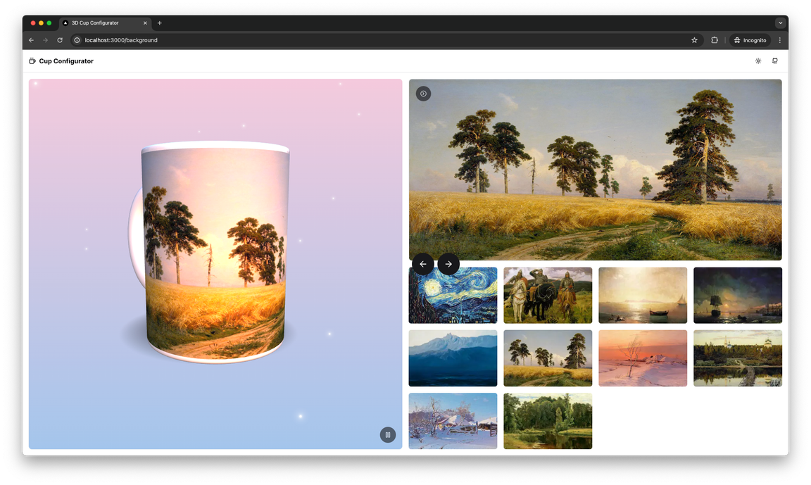
It’s incredibly beautiful!

Implementation of dialog component for AI image generation

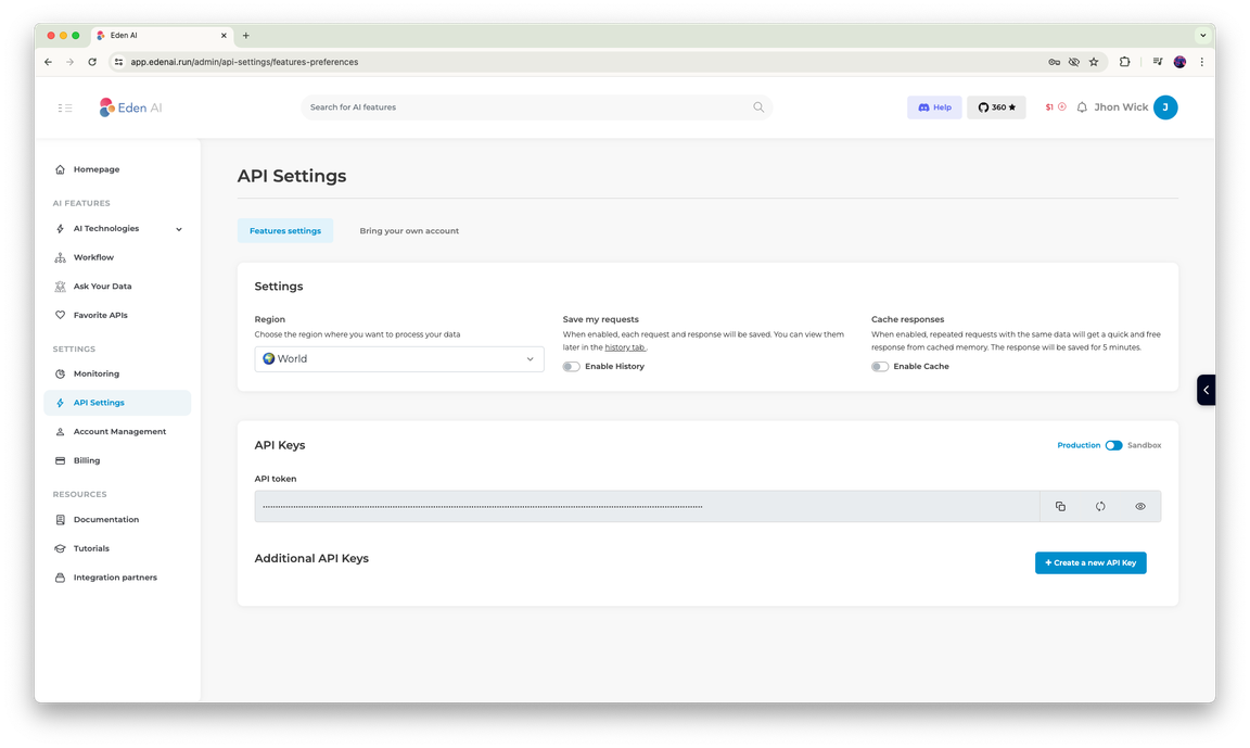
Then the last panel is a component for generating images using AI service - GenerateAiImageDialog.tsx. Before starting to implement it, first create .env.local file in the root directory of the project and copy into it 2 environment variables from .env.example file, which is located in the same directory.

You will need to set the values of environment variables based on the current documentation of the EdenAI service. At the time of writing this article to get the necessary API key you can register a free account in the EdenAI !

As of the date of this article, the API key can be created on the API Settings tab of your personal cabinet after registration:

EdenAI API Settings tab in personal dashboard

In my case, the environment variables look like this:

text
NEXT_PUBLIC_AI_API_ENDPOINT=https://api.edenai.run/v2/image/generation
NEXT_PUBLIC_AI_API_KEY=eyJhbGciOiJIUzI1NiIsInR5cCI6IkpXVCJ9...

After that, the GenerateAiImageDialog.tsx component will look like this:

tsx
'use client'
import {
DialogDescription,
DialogContent,
DialogTrigger,
DialogHeader,
Dialog,
} from '@/components/ui/dialog'
import { SparklesIcon, Loader2Icon, Wand2Icon } from 'lucide-react'
import { Button } from '@/components/ui/button'
import { useFabricCanvas } from '@/lib/hooks'
import { Input } from '@/components/ui/input'
import { useEffect, useState } from 'react'
import { cn } from '@/lib/utils'
import { fabric } from 'fabric'
type TResponse = {
replicate: {
items: Array<{ image_resource_url: string; image: string }>
status: string
cost: number
}
}
const initialConfig: RequestInit = {
headers: {
authorization: `Bearer ${process.env.NEXT_PUBLIC_AI_API_KEY}`,
'Content-Type': 'application/json',
},
method: 'POST',
}
export default function GenerateAiImageDialog() {
const [isGenerating, setIsGenerating] = useState(false)
const [isDialogOpen, setIsDialogOpen] = useState(false)
const [prompt, setPrompt] = useState<string>('')
const [isError, setError] = useState(false)
const { canvas } = useFabricCanvas()
useEffect(() => {
const controller = new AbortController()
const signal = controller.signal
const generateImageFromPrompt = async () => {
try {
const response = await fetch(
process.env.NEXT_PUBLIC_AI_API_ENDPOINT as string,
{
...initialConfig,
body: JSON.stringify({
// Generation config
providers: 'replicate',
resolution: '512x512',
text: prompt,
}),
signal,
}
)
const data = (await response.json()) as TResponse
if (data.replicate.status === 'success') {
const imageUrl = data.replicate.items[0].image_resource_url
// Paste generated image on canvas
fabric.Image.fromURL(
imageUrl,
(image) => {
canvas && canvas.centerObject(image).add(image)
},
{
crossOrigin: 'anonymous',
}
)
}
} catch (e) {
setError(true)
} finally {
setIsGenerating(false)
setIsDialogOpen(false)
}
}
// Run generation when user click on button
if (isGenerating) generateImageFromPrompt()
/* To prevent a race condition, let's abort the generation request with a
* signal if the user closes the dialog before receiving a response with
* the generation result */
return () => {
controller.abort()
}
}, [canvas, isGenerating, prompt])
return (
<Dialog onOpenChange={setIsDialogOpen} open={isDialogOpen}>
<DialogTrigger asChild>
<Button className="h-full w-full" variant="ghost">
<p className="flex items-center gap-2">
<Wand2Icon className="text-violet-500" size={14} />
AI
</p>
</Button>
</DialogTrigger>
<DialogContent className="border-none bg-transparent shadow-none sm:max-w-lg [&>button]:hidden">
<DialogHeader className="text-xs text-white">
Note: This feature is experimental and uses the free version of the
public API. Therefore, the generation time and result may be
unexpected.
</DialogHeader>
<div className="relative">
<SparklesIcon
className="absolute left-2.5 top-1/2 -translate-y-1/2 text-violet-500"
size={16}
/>
<Input
className={cn('w-full py-1 pl-8', isGenerating ? 'pr-11' : 'pr-20')}
placeholder="Enter a prompt to generate an image"
onChange={(e) => setPrompt(e.target.value)}
disabled={isGenerating}
value={prompt}
/>
<button
className="absolute right-0 top-0 flex h-full items-center px-2 py-0 text-sm hover:bg-transparent"
onClick={() => setIsGenerating(true)}
disabled={isGenerating}
>
{isGenerating ? (
<Loader2Icon className="mr-2 h-4 w-4 animate-spin" />
) : (
'Generate'
)}
</button>
</div>
{isError && (
<DialogDescription>
An error occurred or you have reached the limit of free API calls.
Please try again later.
</DialogDescription>
)}
</DialogContent>
</Dialog>
)
}

Enter the prompt in the appropriate field and click the “Generate” button:

Dialog with a user prompt in the input field

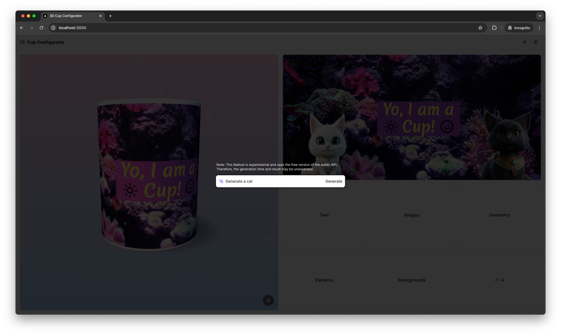
Here is the response result generated by the AI service for the “Generate a cat” prompt using the component just created:

Generated image on Canvas2D and on the cup model

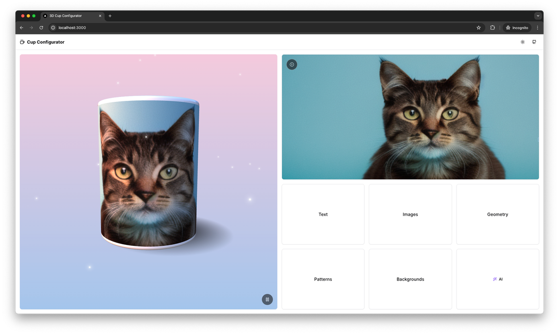
Pretty cute kitty! Now let’s move on to the last point of the plan and publish the source code of the project in the Github repository and deploy the project to Vercel. To do this, you should already have a Github account with a repository created for the project.

Code publishing and deployment

In my case, the commands to publish the project on Github are as follows:

text
git init
git add .
git commit -m "first commit"
git branch -M main
git remote add origin https://github.com/gubatenkov/cup-configurator
git push -u origin main

Then create a new or log in to an existing Vercel account and create a new project and link it to the newly created repository with the project code sourced on Github. Having previously granted all necessary permissions to the Vercel service on Github:

Vercel dashboard page for importing a repository with project code

Don’t forget to specify environment variables from the .env.local file in the Environment Variables field on the project deployment page!

Vercel page for configuring deployment settings

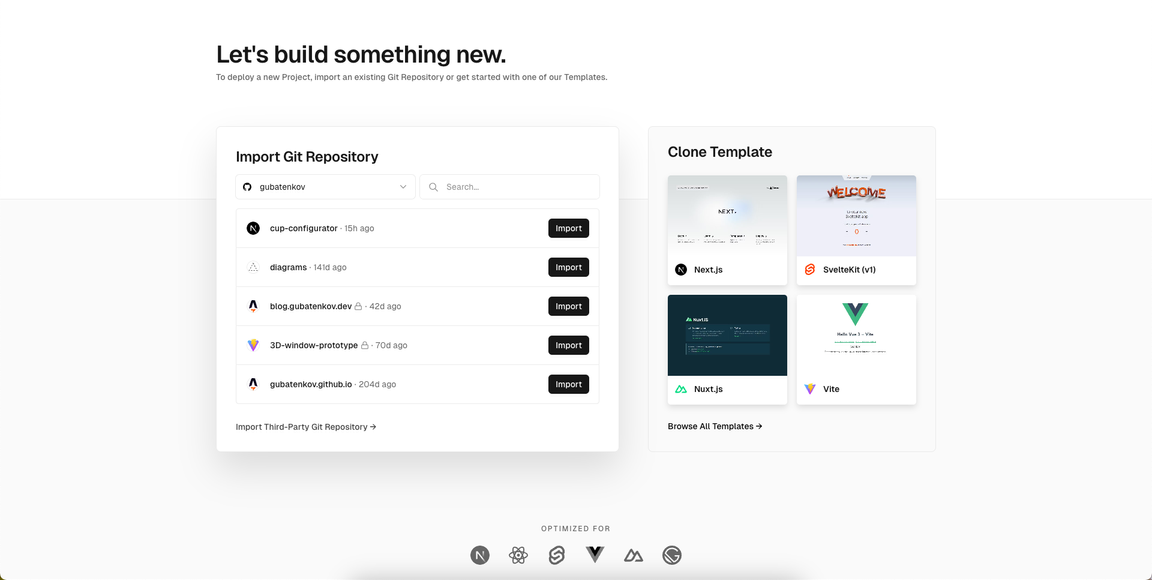
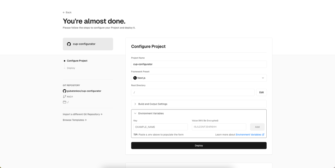
If everything is done correctly, click Deploy and wait for the service to deploy our project and provide a link to the live version of the application.

In my case it is: cup-configurator.vercel.app

Conclusion

In this article we successfully completed the development of the planned functionality for the 3D cup configurator using Three.js, React.js and Next.js. Despite this, you can always independently expand the functionality of the application, as much as your imagination permits.

Above, I have shown how modern frontend technologies can be combined to create interactive and dynamic web application that can benefit business companies reach their target audience and benefit both.

This article is especially will be useful for frontend developers, who want to improve their development skills in the 3D web development direction. Experiment, explore and keep discovering new possibilities!